
Problem
Insurance is notoriously complex and mistrusted. Brolly's app had three core functions: tracking policies, suggesting coverage, and helping users shop for better deals. In practice, though, users struggled to see the value. Onboarding was confusing, flows were inconsistent, and the design didn't guide them to meaningful outcomes.
The startup needed the app to do more than just work. It had to prove the business model: if users weren't engaging, retention and purchases would collapse.
Discovery
User interviews and competitor analysis
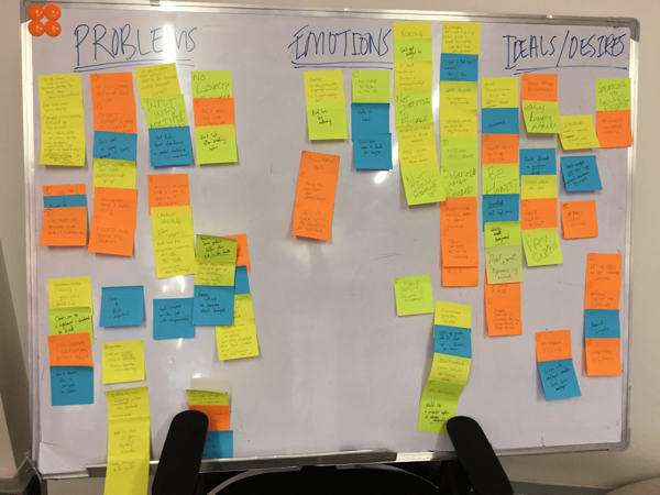
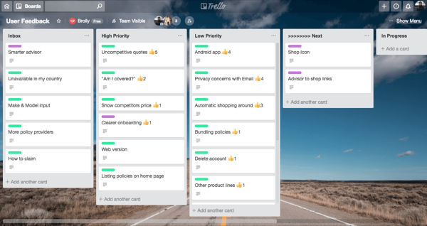
Through user interviews and usage data, we uncovered a clear gap: people didn't want to manage policies in the abstract, they wanted actionable insights. Questions like:
- Am I overpaying compared to others?
- Do I have gaps in my coverage?
- Can I switch quickly without friction?
We also saw users bouncing between screens, unsure of where to find answers. They needed a clear "home" to orient themselves.
Create
Wireframing and testing
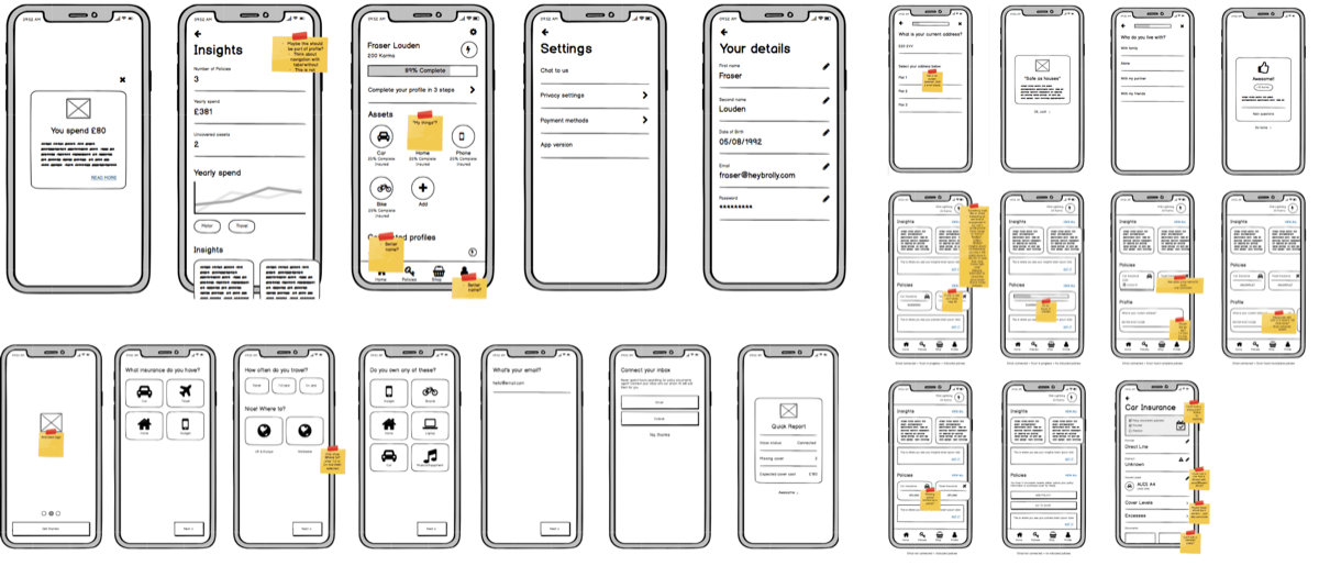
Wireframes are a great way to visualise the information and patterns I've gathered, then start piecing together the experience and interface. Key stakeholders and I reviewed them frequently until we settled on a layout everyone was happy with. I've found that discussions over rough wireframes are far more insightful, creative and useful than discussions over fully designed UI, since they leave stakeholders more open in their feedback.
Design system
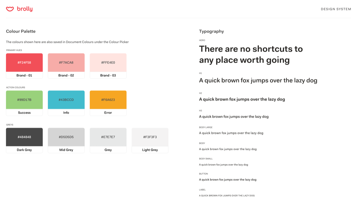
Good infrastructure behind an app design is just as important as the design itself. At Brolly, it was my priority to build a system that enabled cohesive design across all platforms. Alongside defining components, that meant adding new colours to our limited palette and defining a proper typographic scale. The extra colours gave the app more variety and depth, while the typographic scale let us create clearer hierarchies. I built all of this in Sketch, using the Symbols and Text Styles features.
Final designs
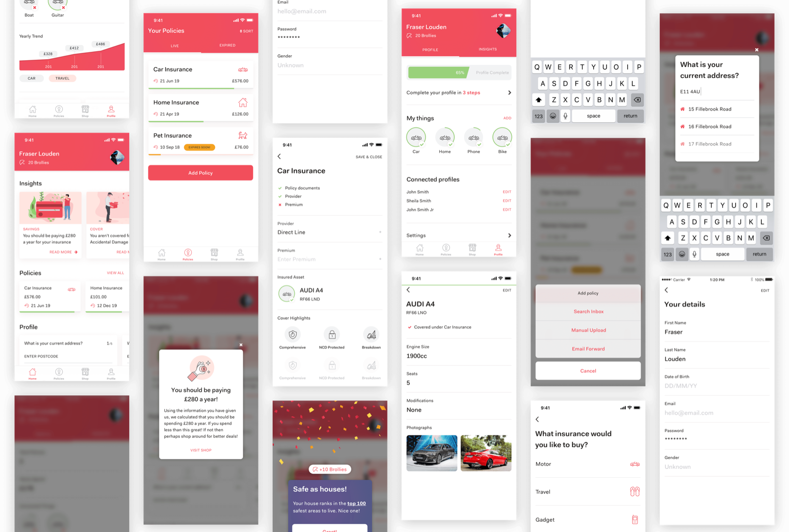
I reframed the app around a dashboard experience: a single, consistent home that surfaced insights upfront and guided users to next actions.
Key decisions:
- Introduced a smart home screen that highlighted urgent issues ("Your car insurance is about to renew") instead of burying them.
- Created a gamified flow for adding policies, making onboarding more engaging.
- Established a design system to unify interactions across the app, reducing cognitive load.
It's about turning complexity into clarity, and giving users a reason to open Brolly weekly, not yearly.
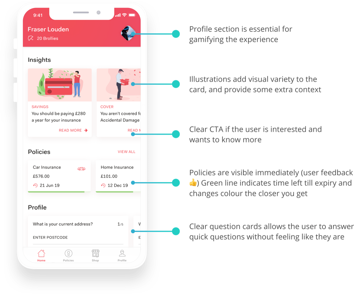
Here we look at Policies in more detail. In the previous app version you'd have to click into a policy to see any information, but by displaying them as cards I could surface the most vital details at a glance. They also carry the same visual style as the home screen, so the app feels consistent throughout. I also added the option to sort by expiring soonest or latest, and most or least expensive.
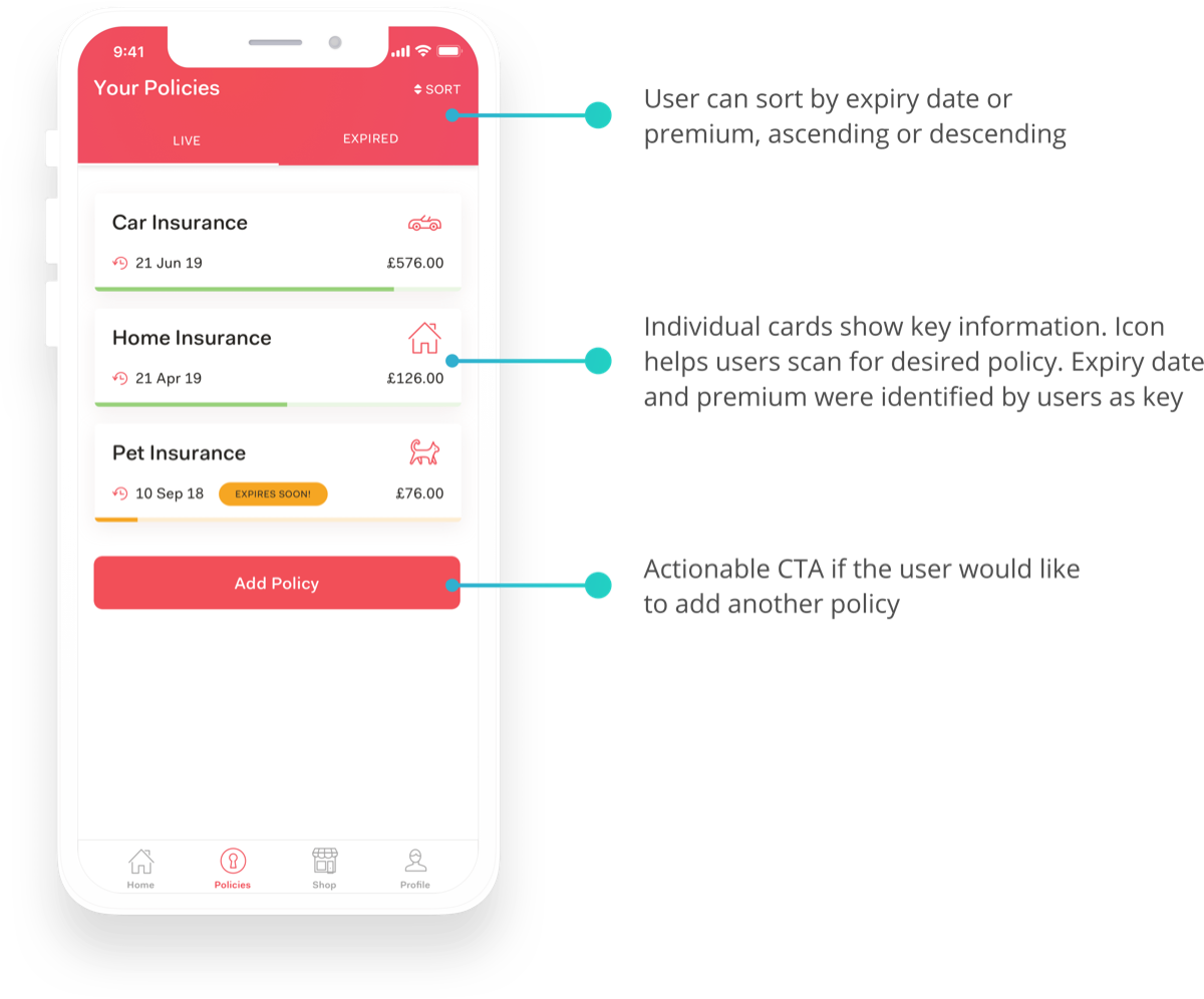
Something new we hadn't explored before was a profile. Since gamifying and rewarding the user was central to the Brolly experience, I felt the app needed a centrepiece for that: the profile. I gave the profile completeness bar a prominent spot near the top, since the more complete a user's profile, the better the quotes Brolly could automatically retrieve for them. Users can also see an overview of their covered assets: a green tick means it's insured, a green ring means the profile for it is complete.
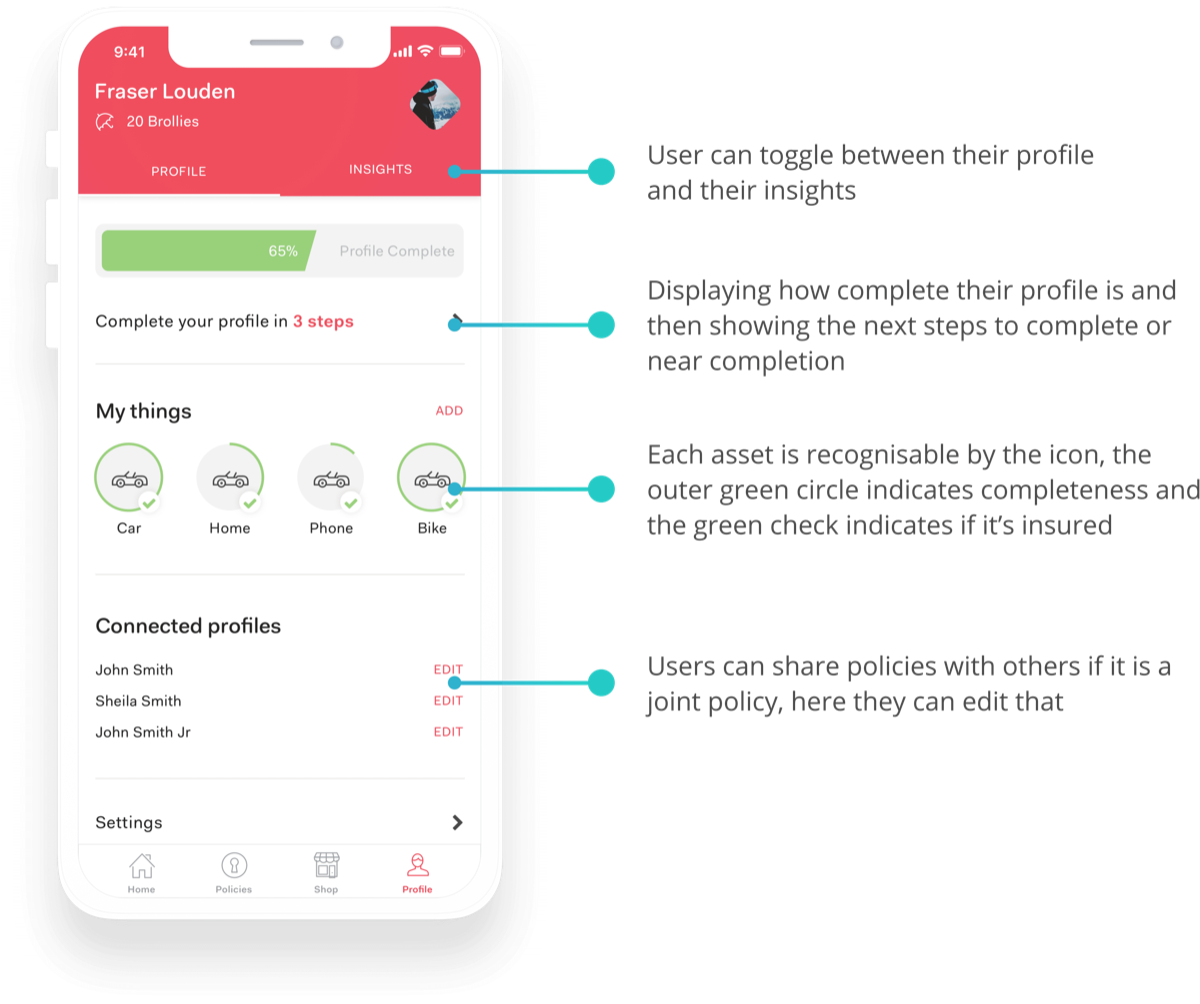
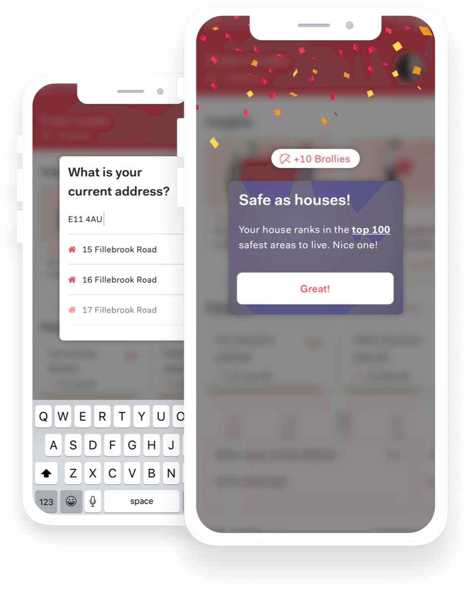
One question I kept coming back to during the redesign was how to reward users for answering questions, especially outside of a quote form. My solution was a small number of easy-to-answer questions on the home screen that opened as a popup and gave immediate gratification once answered.
Outcome
The redesign clarified Brolly's direction: an insurance companion, not just a database. The company was later acquired by Direct Line, but this vision work helped align the team and investors around a more compelling, user-centric product.