
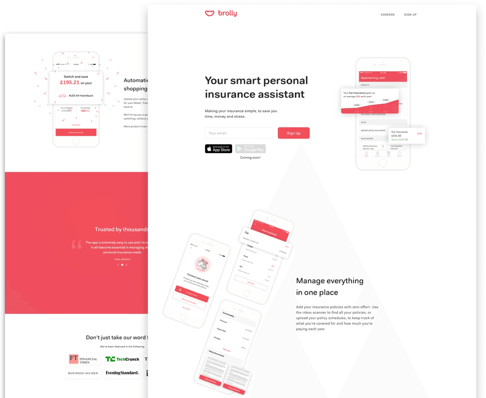
Problem
The old site tried to do everything at once: explain insurance, promote the app, push a new "shop" feature, and showcase thought leadership. The result was a muddled narrative and high bounce rates.
For a small startup, the website wasn't just a marketing asset. It was a conversion engine: if users didn't understand Brolly quickly, they wouldn't download the app or buy through the shop.
Discovery
User research and insights
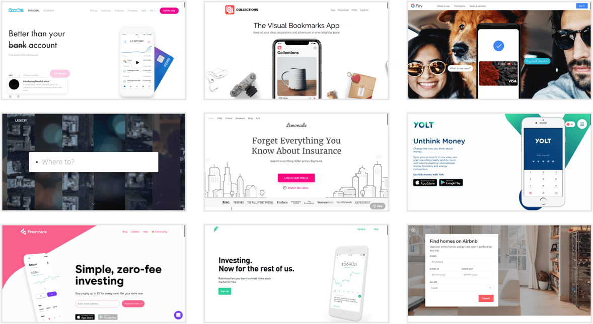
Through competitor audits, content reviews, and analytics, I identified key gaps:
- The hero section was unclear: visitors didn't grasp the value prop in under 10 seconds.
- Trust signals (press coverage, regulatory compliance) were buried.
- Content lacked hierarchy: product, blog, and shop all competed for attention.
Create
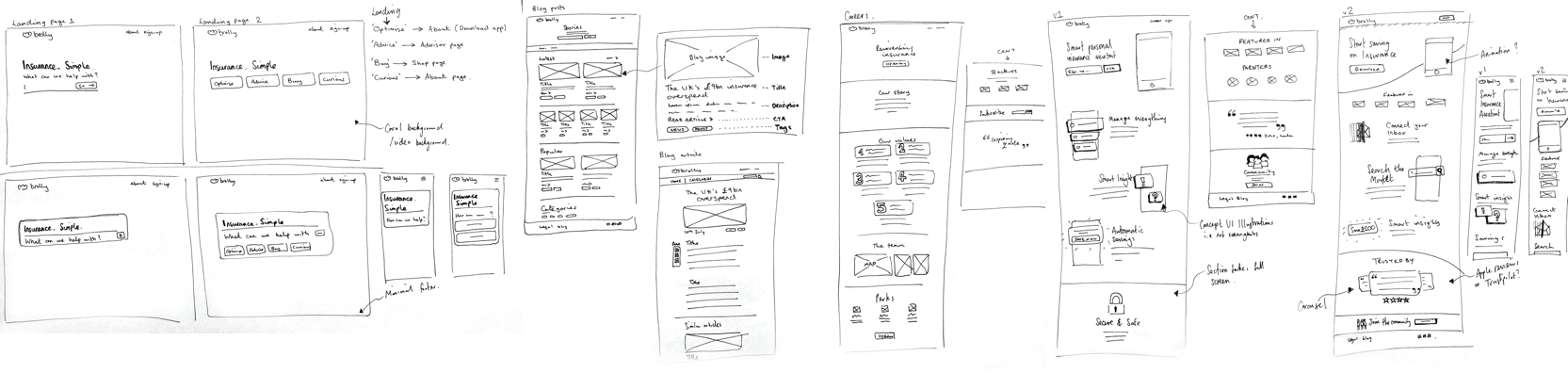
Wireframing and testing
Wireframes are a great way to visualise the information and patterns I've gathered, then start piecing together the experience and interface. Key stakeholders and I reviewed them frequently until we settled on a layout everyone was happy with. I've found that discussions over rough wireframes are far more insightful, creative and useful than discussions over fully designed UI, since they leave stakeholders more open in their feedback.
Final designs
I simplified the site into a clear narrative arc:
- What Brolly does: a simple, jargon-free hero statement.
- How it works: screenshots of the app and shop.
- Why trust us: testimonials, press, and compliance reassurance.
- Next step: a strong call-to-action to download or shop.
Visually, I introduced consistent patterns and a sharper hierarchy, making the site easier to scan and navigate.
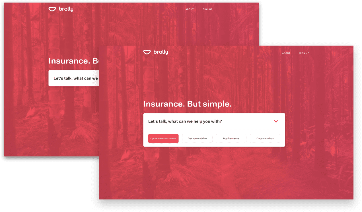
Several months of experimentation and new product and feature launches had left the old website as a confusing collection of different narratives and places to go, between the web shop, insurance advisor, and mobile app. My approach for the landing page was to guide visitors down the right path from the start, with a "Just curious" link for anyone who was just browsing.
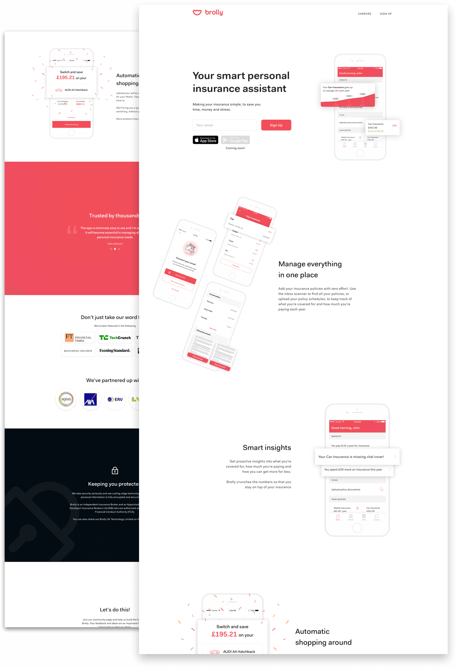
We focused on clear, simple messaging, using shots of the app to help explain functionality. Large amounts of white space and purposefully separated elements kept users engaged with one piece of information at a time and reduced cognitive load. To build trust in the brand, we also added sections on security and showcased our partners.
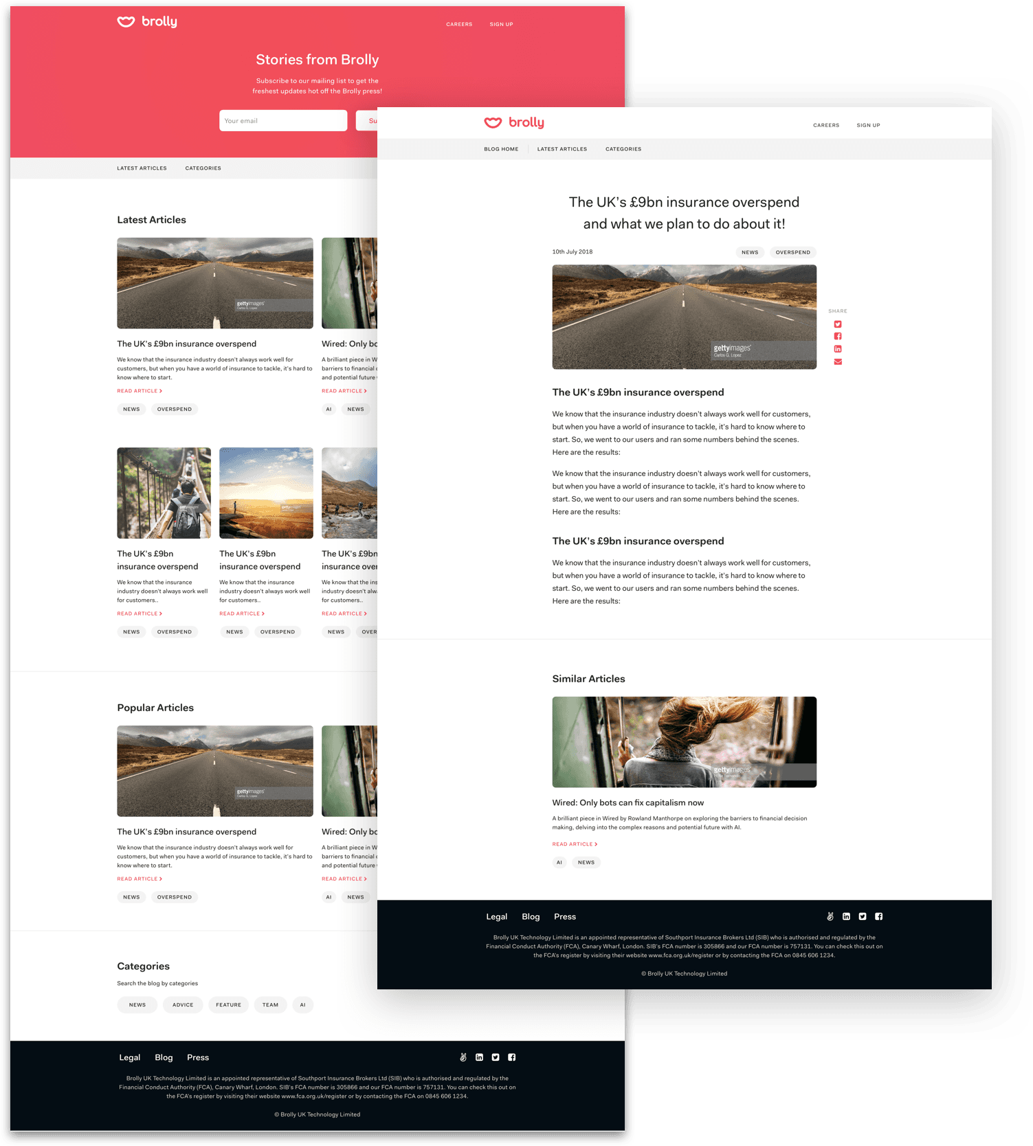
Having a platform where we could easily inform both users and potential users about the benefits of Brolly was crucial to our growth. We split the blog into "Latest" and "Popular" sections, giving constant access to the most useful articles. We took care not to overload it with too many posts, relying instead on clear hierarchy and large images.
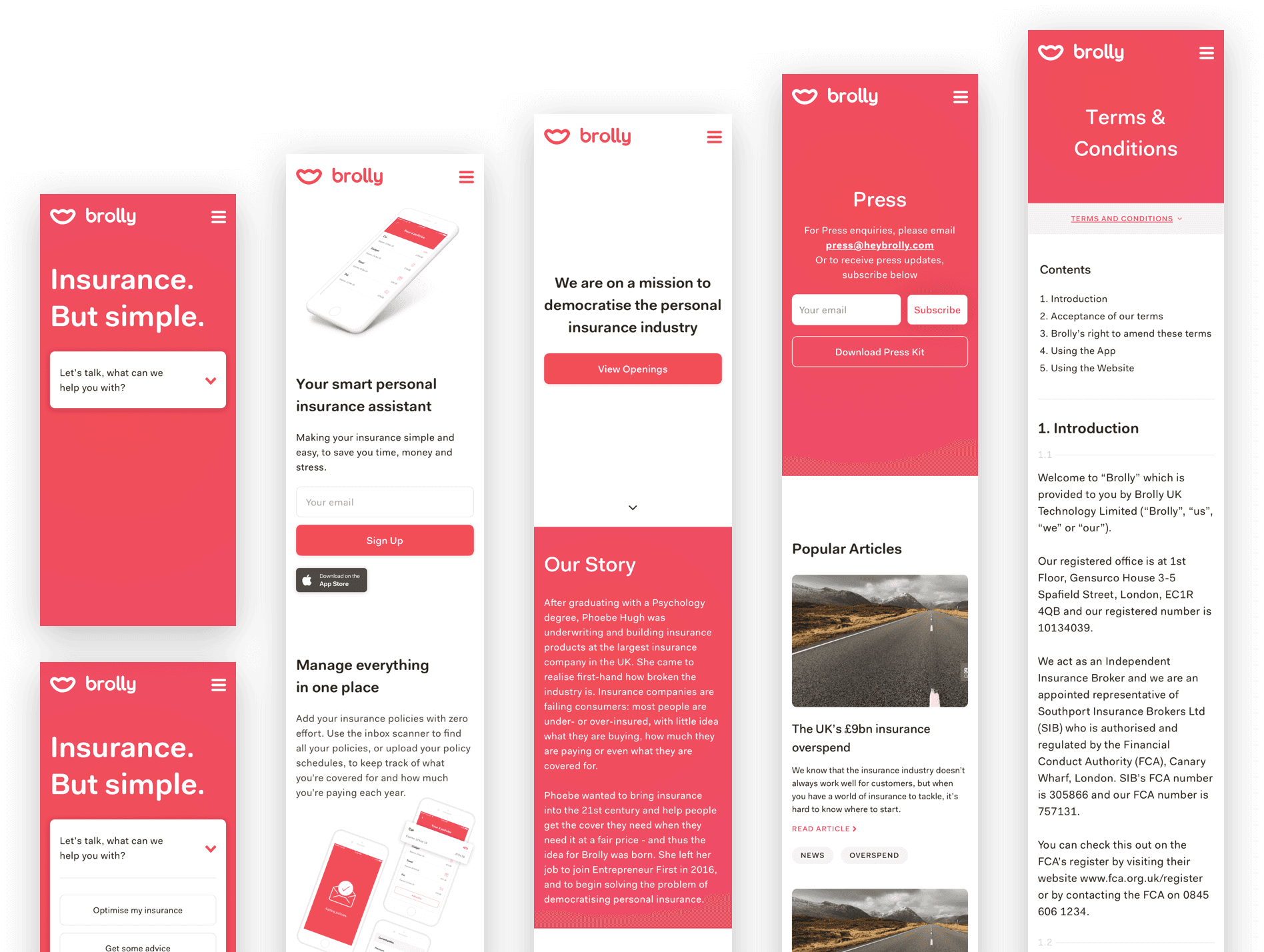
Outcome
The redesigned site drove measurable uplift in conversions. In fact, after the shop went live, it performed so well that it sparked internal debate: "Do we even need the app?"
The website not only supported growth but also clarified Brolly's identity, helping position the startup for its acquisition by Direct Line.