
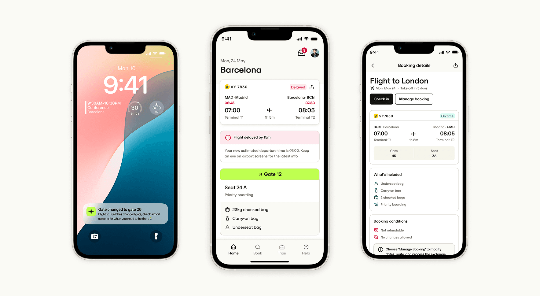
Problem
Flight disruptions are one of the most stressful parts of business travel. Yet Perk's flight status service relied on an outdated pull-based API that refreshed data infrequently, sometimes showing a flight as "on time" hours after it had already departed.
This wasn't just a UX issue. It had measurable business impact: Customer Care was seeing higher contact rates related to delays and missed flights, and our in-trip experience lagged behind competitors.
A Kano survey confirmed this gap: "up-to-date and reliable flight information" was the top delight feature, with gate and platform details ranking second. Fixing this wasn't optional. It was foundational to delivering the 7-star mobile experience promised in our strategy.
Discovery
User research and insights
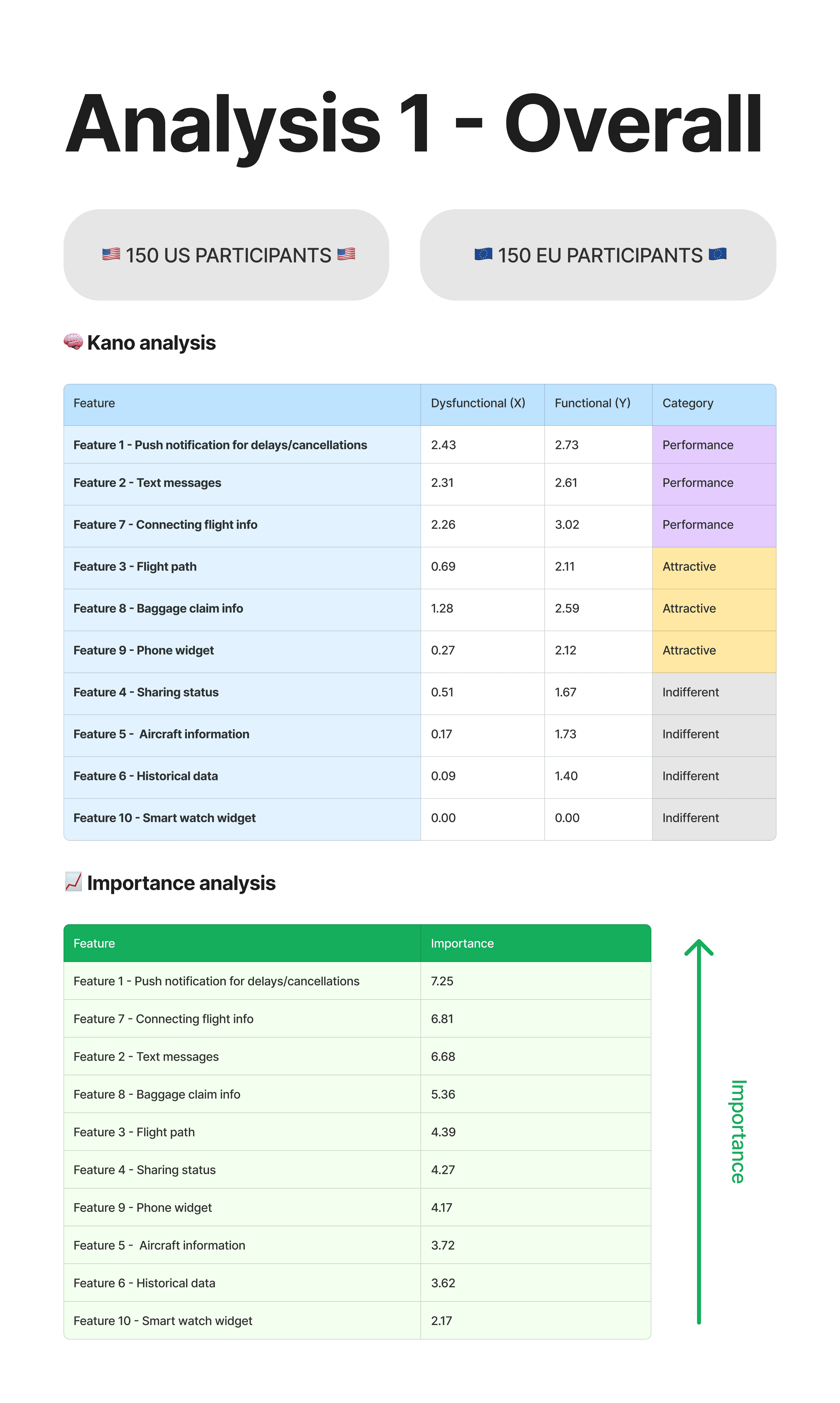
To better understand what users needed, I ran a Kano survey across US and EU travelers, combined with benchmarking against leading airline and aggregator apps (Flighty, Google Flights, FlightRadar).
That surfaced three clear insights:
- Speed and reliability matter more than volume: users didn't want endless data, just fast, accurate updates.
- Regional nuances: US travelers valued baggage belts and gates, while EU travelers prioritized coordination with ground transport.
- Reassurance over data: users wanted confirmation they could trust, not a long list of details.

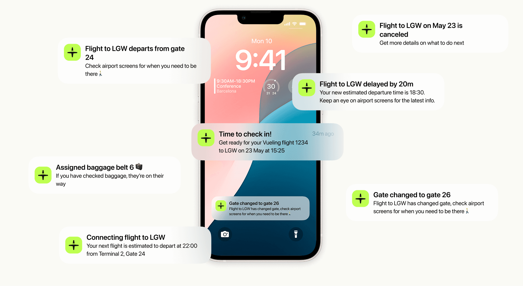
User feedback also highlighted confusion about what would trigger a notification, so we explored how different data points (delay, gate change, cancellation) should be surfaced and when to step in with push notifications or Live Activities.
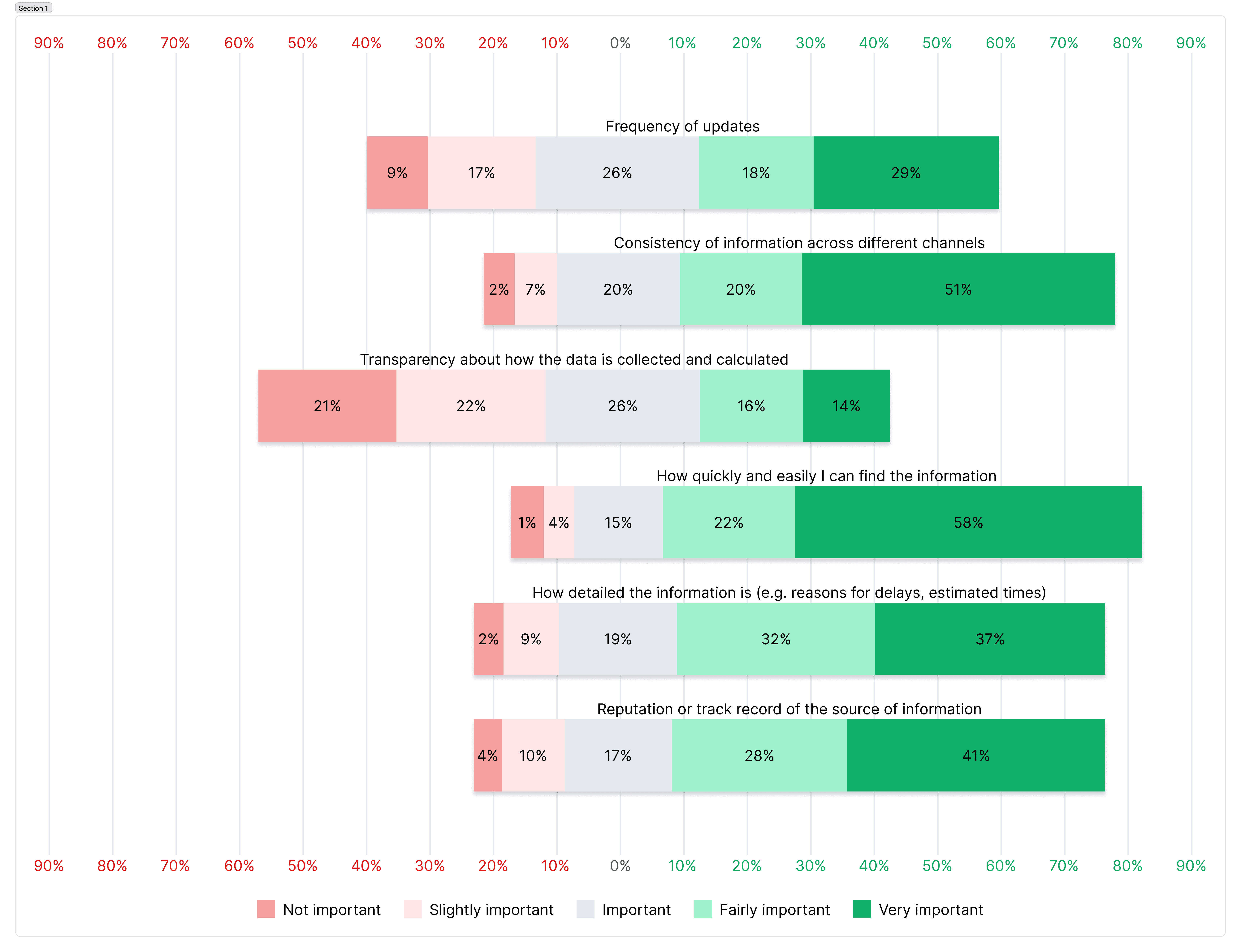
From this, we defined a few hypotheses and metrics:
- More accurate data would improve satisfaction and trust (measured via Travel CES).
- Real-time updates would lower contact ratio by up to 15% for flight disruptions.
- In-app flight tracking would drive +5 percentage points in mobile adoption.
These insights shaped both the design and the technical roadmap.
Create
Design approach
Working with engineering and product, I helped define a phased delivery strategy that balanced user impact with technical feasibility.
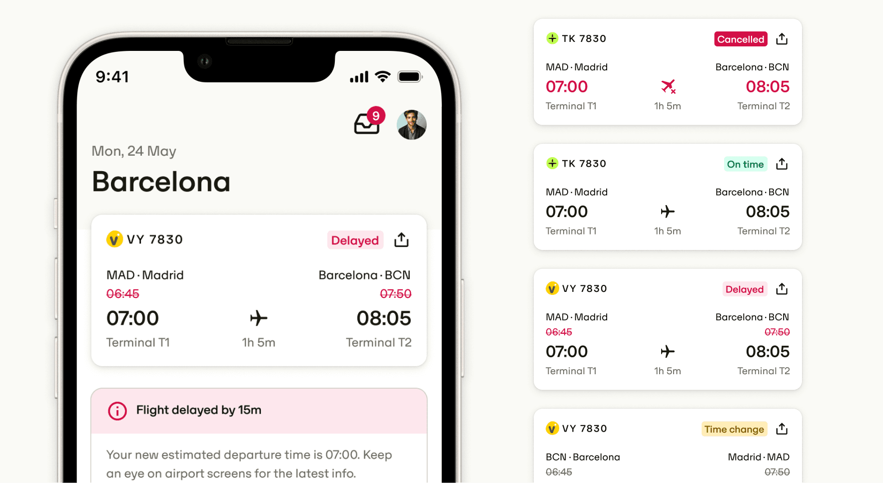
Design-wise, I focused on clarity and scalability. The service card pattern became our core framework, keeping things consistent across the HomeHub, trip details, and future expansions like rail status and split tickets. We refined the information hierarchy, simplified delay messaging, and dropped confusing elements like strikethroughs for cancelled or delayed flights.
Outcome
Flight Status launched in phases throughout 2024. Results:
- +5pp increase in travel usage rate, from 59% to 65%.
- +20pp increase in push notification interactions, from 35% to 55%.
- Lower contact ratio for disrupted flights as users began self-serving rebookings.
Beyond the metrics, this showed the real impact mobile-first features can have on the traveler experience.