
Problem
The existing IA had been designed around the traveler persona. Over time, feedback revealed pain points: people struggled to find key trip details, manage their bookings, or understand where actions like approvals lived.
When the expansion into expenses began, this confusion risked multiplying. Our structure no longer reflected our product vision, which now included Travel, Spend, and Approvals. If we didn't redefine the architecture, we'd fail both travelers and submitters.
This work quickly became a strategic priority: its success was heavily intertwined with the business goal of delivering an all-in-one travel and expense platform.
Discovery
User research and insights
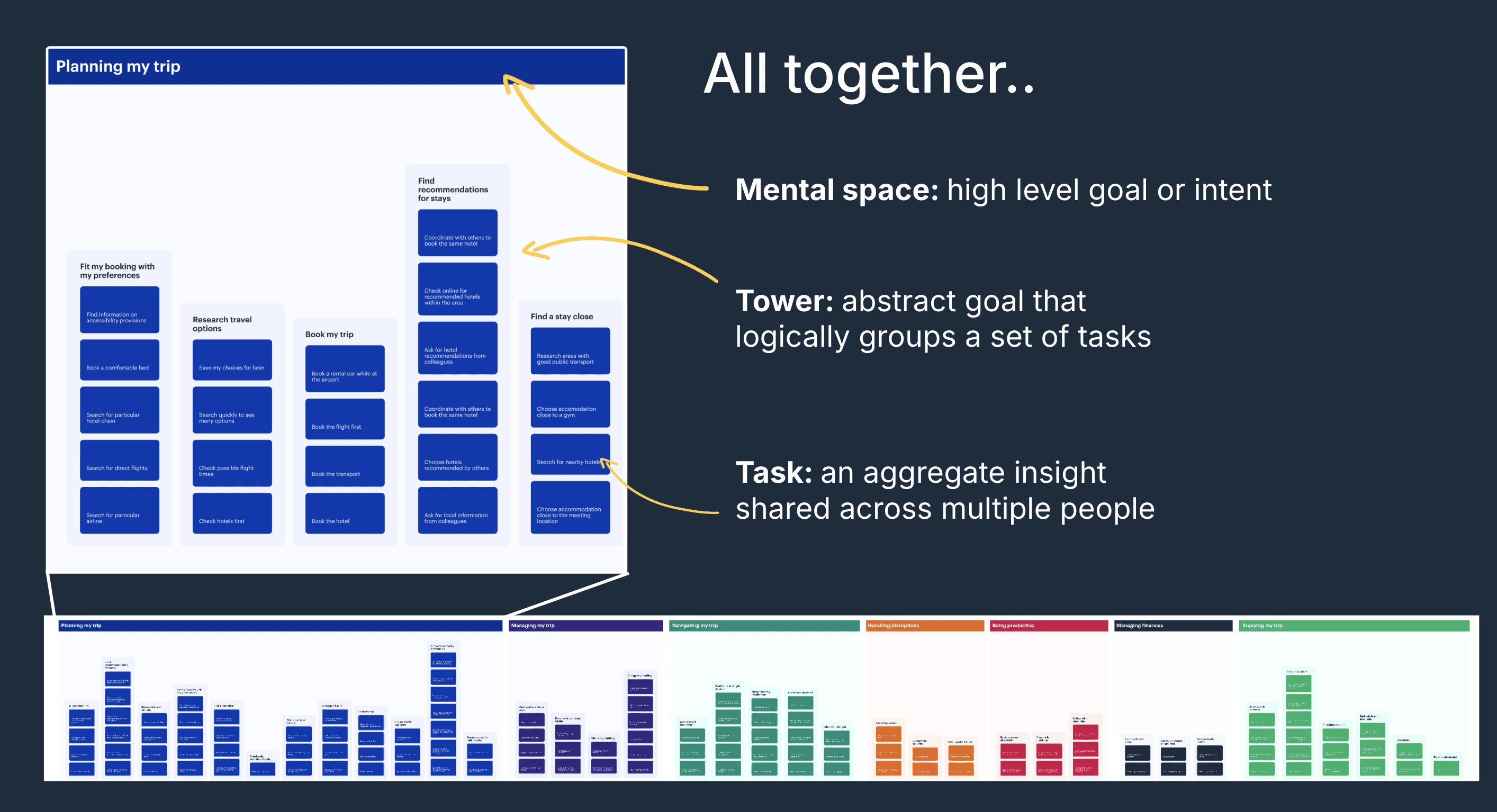
To ground the redesign, we built on prior mental model research I had led at the end of the previous year. That work revealed how travelers naturally think in journeys and actions rather than categories like "Trips" or "Bookings."
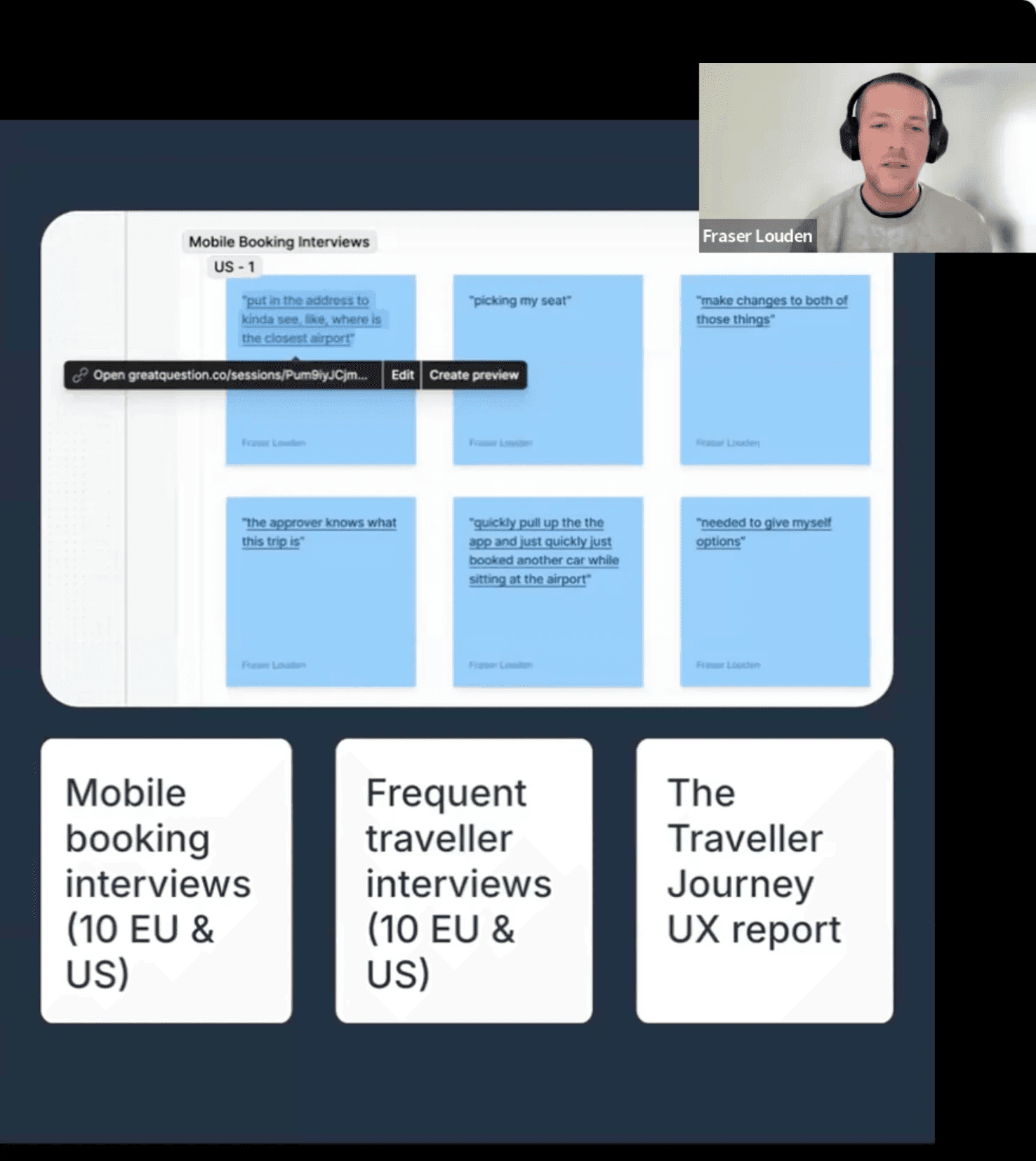
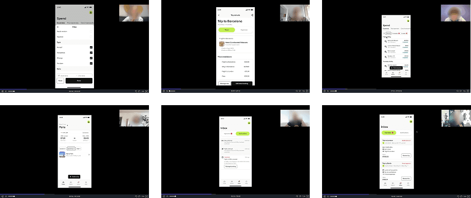
We then ran usability testing and in-depth interviews with 12 users across the US and EU (8 traveler-submitters, 4 approvers), exploring early and high-fidelity prototypes of the new IA.
Key insights shaped our direction:
- Users saw clear value in separating Travel and Spend, as it mirrored how they thought about their tasks.
- Submitters wanted all expenses in one place and found the distinction between Expenses, Trip Expenses, and Card Transactions unclear.
- Approvers wanted to keep their own travel and spend separate from that of their direct reports.
- Offline mode and quick draft-saving were seen as essential, especially for frequent travelers managing receipts mid-trip.
This combination of behavioral insight and usability testing made one thing clear: clarity will come from aligning the IA to how people think, act, and move through their business day.
Create
Design approach
I facilitated a series of cross-tribe IA workshops bringing together content, research, product, and engineering to align around shared principles. Together, we mapped multiple navigation prototypes in FigJam, tested early versions, and iterated toward a model that balanced clarity, scalability, and long-term flexibility.
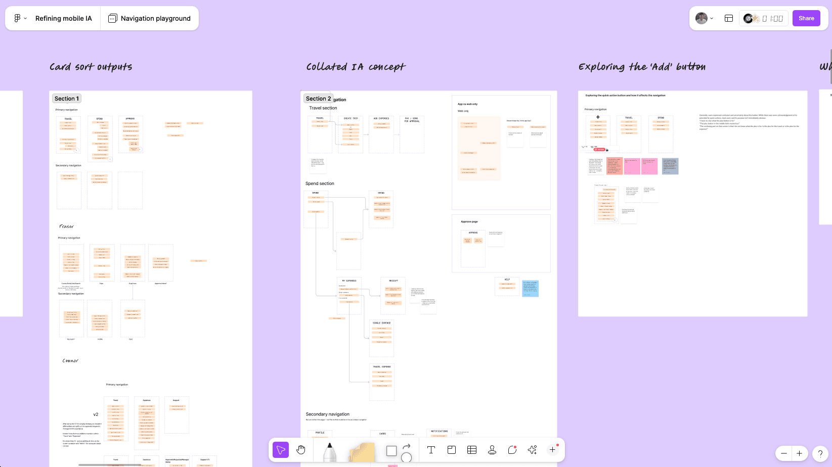

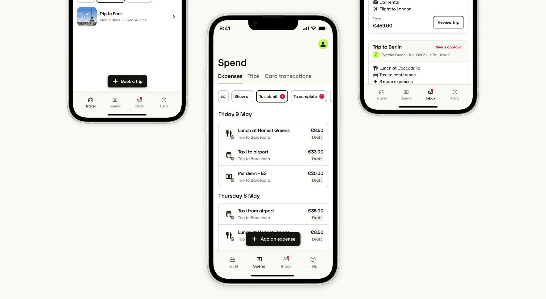
The final structure introduced four clearly defined spaces:
- Travel: All trip-related content and actions in one place.
- Spend: A new unified hub for expenses, receipts, and card transactions.
- Inbox: For approvals and time-sensitive alerts.
- Help: For support and account management.
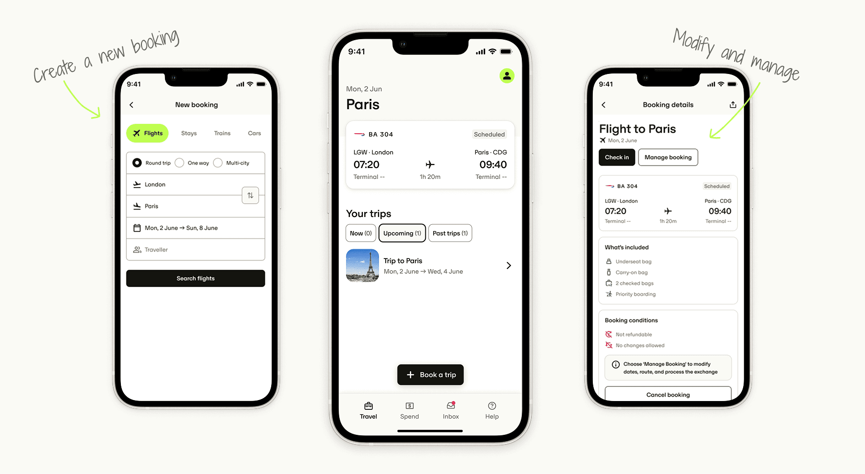
As each Perk product is sold as a standalone module, it was essential that each tab felt self-contained. Within the Travel tab, users can complete all travel-related tasks without switching context: viewing upcoming trips, checking flight or rail status, managing bookings, and accessing in-trip information like hotel check-ins or gate updates.
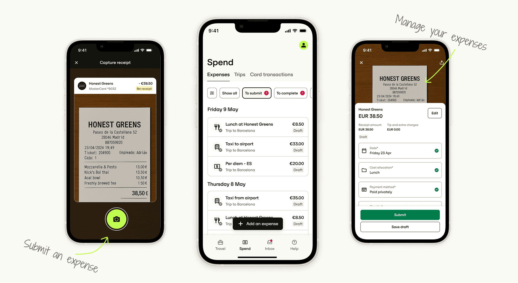
The Spend tab brings together all expense-related activity into a single unified space, from receipt capture and draft saving to card transactions and trip expenses. This consolidation reduces confusion between "trip" and "non-trip" expenses and gives submitters a clear starting point for managing everything they spend while travelling.
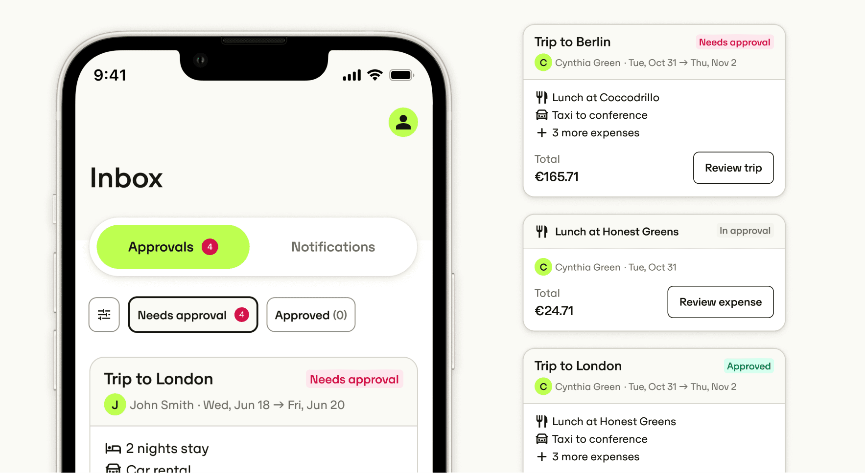
The Inbox tab was designed as an action centre for time-sensitive tasks like approvals and notifications. It surfaces what's urgent first, such as travel requests or expense revisions, and helps users prioritise without needing to navigate elsewhere.
Outcome
The new IA defined how Perk will scale across multiple user types and modules:
- Consolidated all travel actions under a single Travel tab.
- Introduced a Spend tab, reflecting our shift toward an integrated Travel & Spend experience.
- Provided a clear, flexible structure for features such as Approvals, Cards, and Events.
Although full rollout is planned for 2026, the work has already influenced tribe-level design decisions, aligning mobile and web teams around one shared IA vision. It's now used as the reference point for the full initiative and broader Travel & Spend integration.
I also helped shape Perk's 2026 Spend strategy by advocating for a fully native expense submission experience. Through IA work and concept prototypes (shown), I showed how a native flow could turn expense submission from a compliance task into a fast, seamless action that drives adoption.
This vision influenced the 2026 roadmap, where "Submit with ease" became a key initiative, positioning design as a driver of strategic clarity, not just execution.